In this article we’ll discuss basic project settings in Figma, that is all you need to know before you start designing. We’ll explain what Frames, Layout grid and Rulers are. Read on to find out more.
Basic project settings in Figma – table of contents:
- Frames
- Layout grid
- Rulers
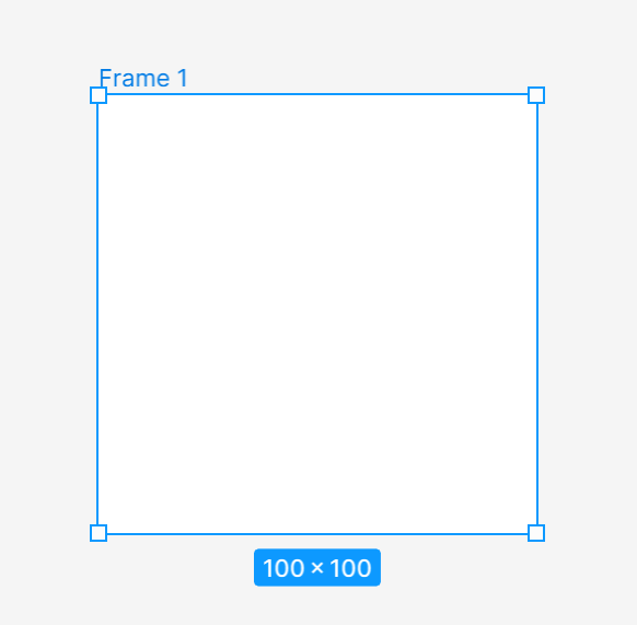
- click on the Canvas in order to create a default frame with 100×100 dimensions
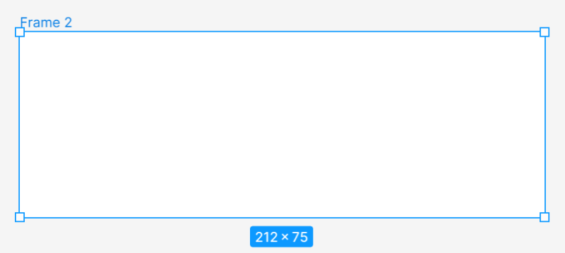
- click and drag in the Canvas to create a frame with custom dimensions
- use the dropdown in the right sidebar to select a frame preset
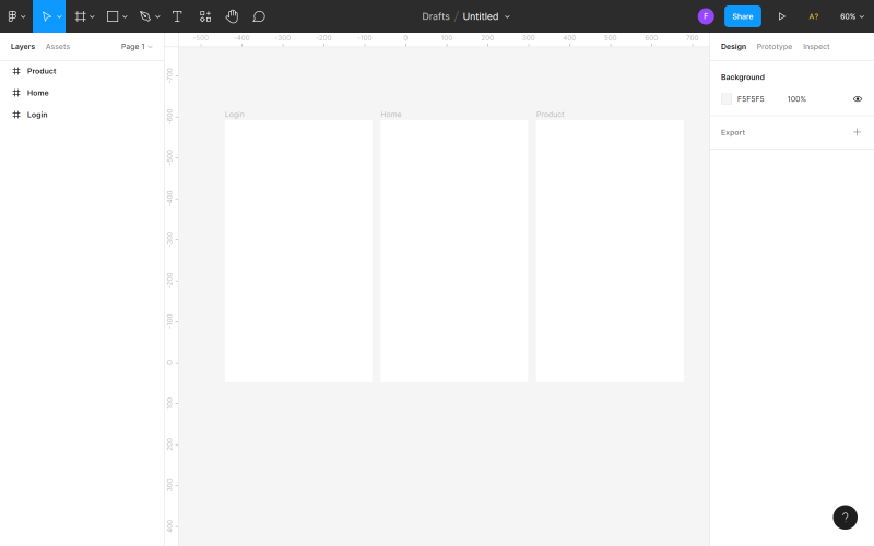
- login screen (Login)
- homepage (Home)
- product landing page (Product)
- you can enable the grid view even before you start designing and use ready-made grid layouts (if there are any in your library) or create your own,
- you can also start creating the design first, and set the grid later based on the designed elements.
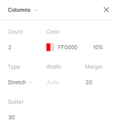
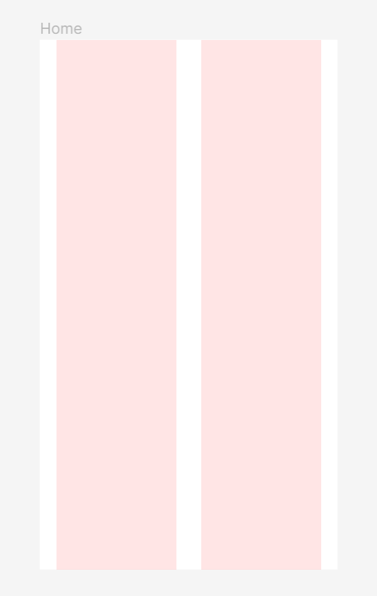
- Count 2 (number of columns)
- Margin 20 (distance of columns from the edge of the screen)
- Gutter 30 (distance between columns)
Basic project settings in Figma
First, you need to choose an area of the Canvas to create your designs in. That’s what the Frame tool is for. You will find it in the Toolbar. After activating the Frame tool, you have a few options of creating a frame.

After adding and selecting a frame, you have access to it in the Properties panel.
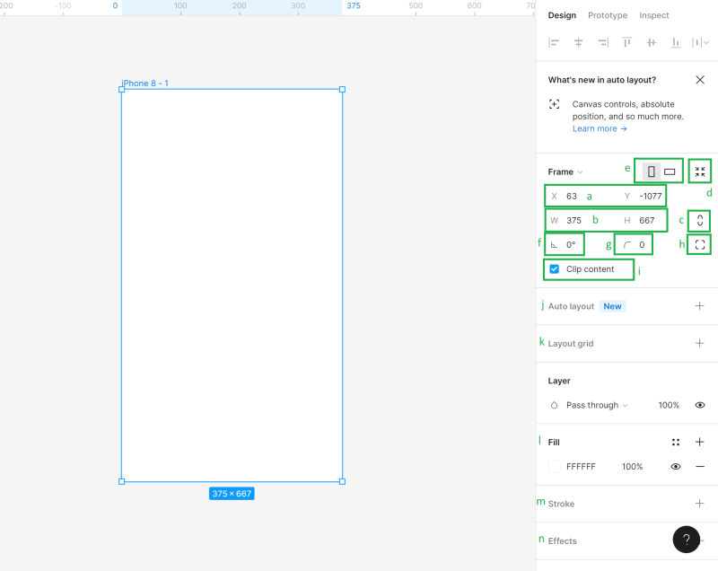
a) Position of the Canvas (X and Y) – here you can specify the position of the frame in the Canvas on the horizontal (X) and vertical (Y) axis.
b) Dimensions of the Object (Width and Height) – here you can change the size of the frame
c) Constrain proportions – It allows you to keep the proportions of the frame when resizing. This way you can change the height or width of the frame, and the second parameter will adjust automatically.
d) Resize to fit – this function lets you resize the frame to fit its contents.
Useful tip: You can also change the size of the frame manually: grab the edge or corner of the frame (the cursor will turn into a black double arrow), then drag to get the preferred size.
e) Portrait and Landscape – here you can change the orientation of your frame to vertical or horizontal
f) Rotation – it lets you adjust the angle of a frame
g) Corner Radius – thanks to this function you can round the corner of a frame to create softer edges
h) Independent corners – the independent corner setting lets you adjust the corner radius for each corner.
i) Clip Content – it will allow you to hide any objects that extend beyond the frame’s boundaries
j) Auto Layout – it lets you create responsive frames
k) Layout Grids – this feature helps create a structured user interface
l) Fill – using this option will let you fill your frame with color, gradient or photo
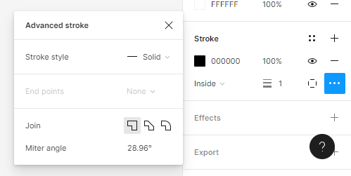
m) Stroke – it helps add strokes to a frame. You can also use Advanced stroke settings that can be found under the ellipsis icon.
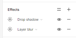
n) Effects – here you can add a shadow or blurs to a Frame. Click the Effect settings icon to adjust the shadow’’s settings.
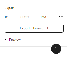
o) Export – here you can export your frame to the following formats: PNG, JPG, SVG and PDF.
Above each frame in the Canvas, its name is displayed. In order to change it, click on it twice. You can copy frames along with its contents and paste them to the Canvas as many times as you want.
Task.3.1
Start working on the project from choosing the right size of a frame. Useful tip: If you don’t know what size should your frame be, a good choice would be to use one of the most popular screen sizes. Go to https://gs.statcounter.com/screen-resolution-stats for more information.In this tutorial we’ll design an e-commerce mobile app, so let’s select one of the most frequently used resolutions for smartphones – 360×640 px.
We’ll prepare 3 projects together
After adding a frame, duplicate it right away, and name each screen properly, so as to keep the file organized.
Layout grid
Layout grid is a system of horizontal and vertical lines (columns or rows) that help you keep elements precisely aligned in your frames. A properly set grid will certainly make your work easier and speed up the entire design process. There are two ways to set the layout grid in your design:
Useful tip: If you’re a novice designer, we recommend applying a layout grid to any project. There is nothing worse than a completely empty workspace.
You can add a Layout grid to an active frame in the Properties panel. You have 3 options: grid, columns, row. You may choose a few options at the same time.
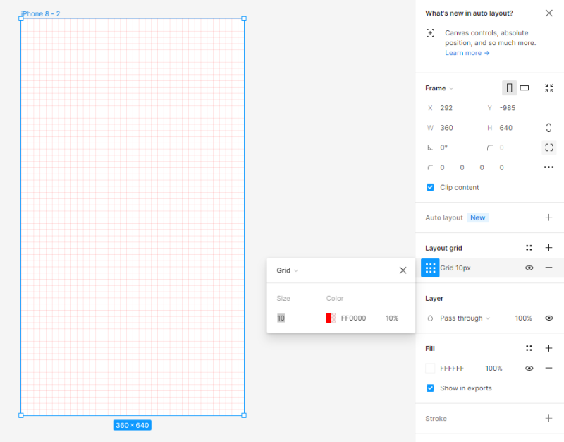
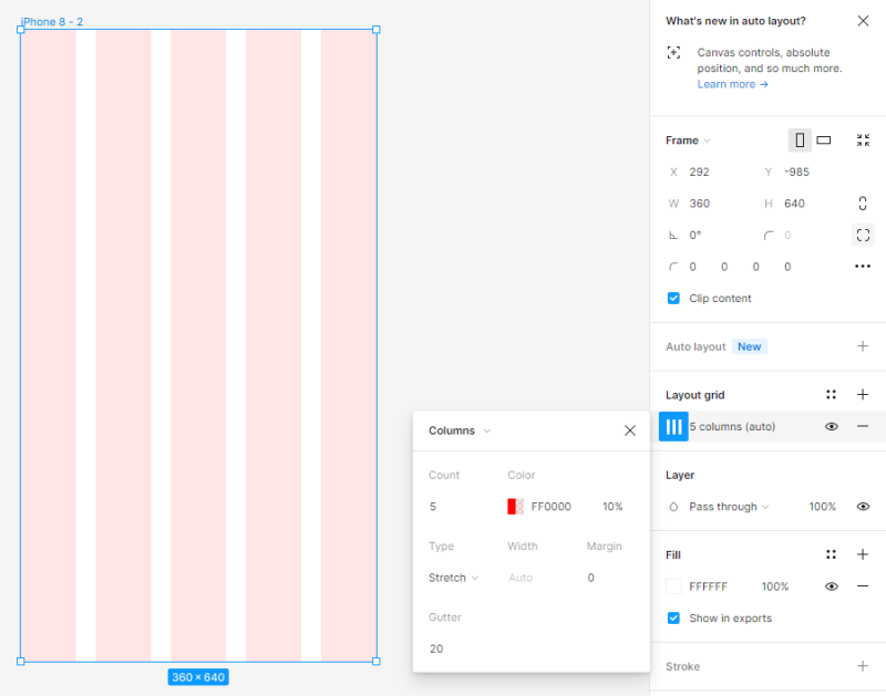
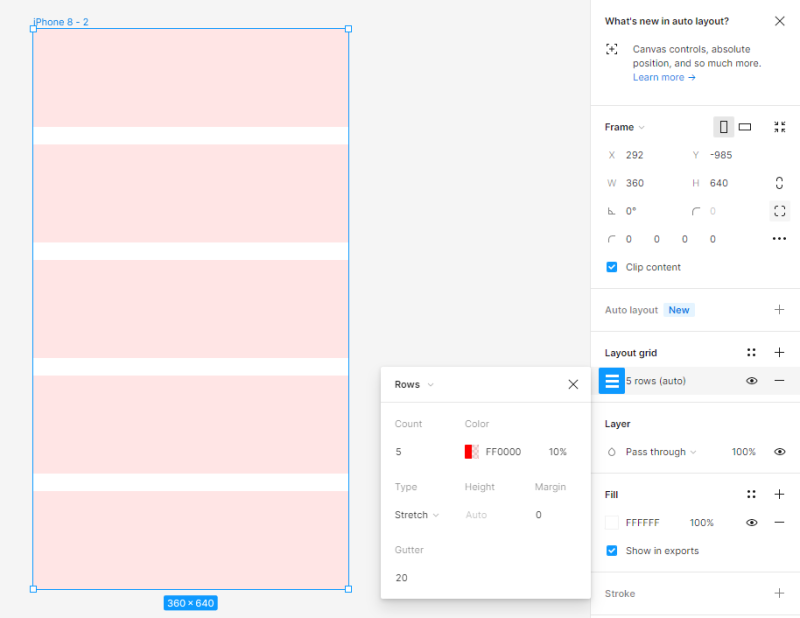
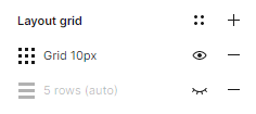
You can adjust the settings of every grid in the Layout grid settings panel. You can turn the grid’s visibility on or off at any time by clicking the Eye icon.
Useful tip: If you don’t know which layout grid to choose in your project, you can use the Grid System plugin, which will do it for you.
Task 3.2. Set the layout grid in your project. For the purposes of this project, we selected Columns and set the following values:

Rulers
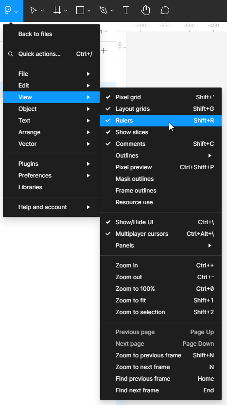
Rulers are another useful feature that will help you align the elements in the file and keep it in order. To switch on the Rulers view, click on the Main menu, then View and Rulers.
Rulers can be seen at the top and left of the Canvas. With this feature, you can create vertical and horizontal lines (guides) – click and hold the chosen ruler, then move the cursor to the Canvas area. A thin, red line will appear, which you can move. You may create as many guides as you want. You can easily delete unnecessary lines – just select the line (the chosen line will turn blue), and then click Delete.
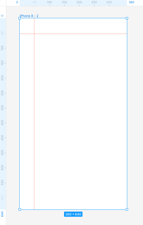
Task 3.3. Experiment with adding rulers. They will be helpful when aligning the elements.
You’ve just learned about basic project settings in Figma. Read also: AI-assisted chat bots.

If you like our content, join our busy bees community on Facebook, Twitter, LinkedIn, Instagram, YouTube, Pinterest.
Author: Klaudia Kowalczyk
A graphic & UX Designer which conveys into design what cannot be conveyed in words. For him, every used color, line or font has a meaning. Passionate in graphic and web design.
