The Burndown Chart allows you to assess the stage of completion of the current Sprint or the entire project being worked on by the Scrum Team. But most importantly, it shows how much time is needed to achieve the Sprint Goal or Product Goal. To some extent, it also enables you to measure changes in the effectiveness of the Development Team. And thanks to that, it is possible to assess the probability of finishing the tasks on time. This is because the Burndown Chart shows how much work has already been done and how much remains.
Burndown Chart – table of contents:
- What is a burndown chart?
- What does a burnown chart look like?
- Estimation of task completion time
- Summary
What is a Burndown Chart?
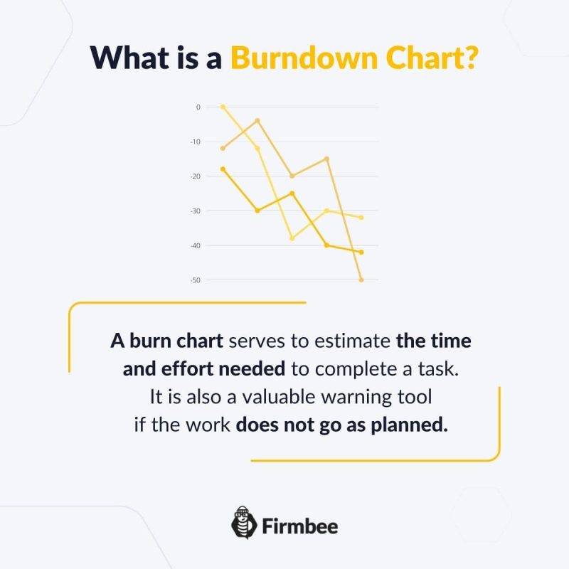
A Burndown Chart serves to estimate the time and effort needed to complete a task. It is also a valuable warning tool if the work does not go as planned. With a single glance, each Scrum Team member is able to assess the status of the tasks. Therefore, the Burndown Chart should be easily accessible to everyone involved in the project.
The Burndown Chart in Scrum features in two versions: as a Sprint Burndown Chart and as a Project Burndown Chart. We will discuss them together because the principle behind them is identical. They differ only in the time scale and the number of tasks they depict.
What does a Burndown Chart look like?
On the Burndown Chart, the X-axis shows the time remaining to complete the work. If the chart is for a Sprint, the time is measured in days. On the other hand, if the Burndown Chart is for an entire project, time is usually measured in Sprints.
The Y-axis of the Burndown Chart indicates the amount of work remaining. Thus, it refers to the tasks included in the Sprint Backlog or the Product Backlog. The units used on the vertical axis of the chart can be:
- Story Points – which you can read more about in the text on User stories
- Man Days/Hours
- Tasks
- Glossary of basic terms, roles and notions
- What is Scrum?
- Scrum values
- How to implement Scrum in your company?
- Scrum Team - what is it and how does it work?
- Who is a Product Owner?
- The most common mistakes of Product Owner
- Who is the Scrum Master?
- Characteristics of a good Scrum Master
- The most common mistakes of Scrum Master
- What statistics and metrics should the Scrum Master track?
- Cooperation between Product Owner and Scrum Master
- Development Team in Scrum
- The most common mistakes of Developers
- Scrum artifacts
- Scaling Scrum
- Sprint Backlog
- What is the Product Backlog?
- What are User Stories?
- Creating the best User Story with INVEST
- The most common User Story mistakes
- User Story Acceptance Criteria
- Estimation and Story Points in Scrum
- Planning Poker
- Team Estimation Game
- Defining Increment
- Scrum events
- What is Sprint in Scrum?
- Scrum Team Commitments - Product Goal, Sprint Goal and Definition of Completion
- What is a Burndown Chart?
- How to create and interpret a burndown chart?
- Advantages and disadvantages of the burndown chart
- Kanban boards in Scrum and Scrumban
- Velocity in Scrum - Speed of the Development Team
- Daily Scrum
- Sprint Planning
- Sprint Review
- What is a Sprint Retrospective?
- Common mistakes during a Sprint Retrospective
- Product Backlog nurturing
The Burndown Chart typically includes a burn-down line that represents a perfect, linear decrease in the number of tasks that remain to be completed. It provides an outlook on the projected completion time.

Estimation of task completion time
Each Developer individually needs to estimate the number of hours they need to complete a particular task. And the estimated time to complete a Sprint Goal or Project is the sum of time estimated by all Developers. The immense difficulty is to translate the estimated time into the actual time of task execution. This is one of the major problems newly formed Development Teams face It can distort the picture presented on the Burndown Chart.
Moreover, it is not always possible to create an optimal workflow in a Development Team. As a result, task execution may suffer from downtime, which increases the task completion time.
One of the indicators of Team maturity is the ability to accurately estimate the work time. The more predictable, the more mature the team is. This is reflected in the burn rate graph, where the line reflecting real burn rate descends steadily to zero. However, this formulation does not apply to all situations.
As we wrote in the article about the statistics monitored by Scrum Master, much depends on the nature of the project itself: its innovation and the repetitiveness of the tasks performed by the Developers. The burndown chart works best for projects where the scope of work is fixed and known. Therefore, in case of innovative projects it is better to use other ways of measuring team effectiveness.

Summary
The Burndown Chart works well as a basic progress metric for most Development Teams. It is a tool to visualize the workload and time required to achieve a Sprint Goal or Product Goal. Because of its clarity and accessibility, the Burndown Chart allows all Scrum Team members to assess, in real time, where the project work is at.
If you like our content, join our busy bees community on Facebook, Twitter, LinkedIn, Instagram, YouTube, Pinterest.
Author: Caroline Becker
As a Project Manager, Caroline is an expert in finding new methods to design the best workflows and optimize processes. Her organizational skills and ability to work under time pressure make her the best person to turn complicated projects into reality.


