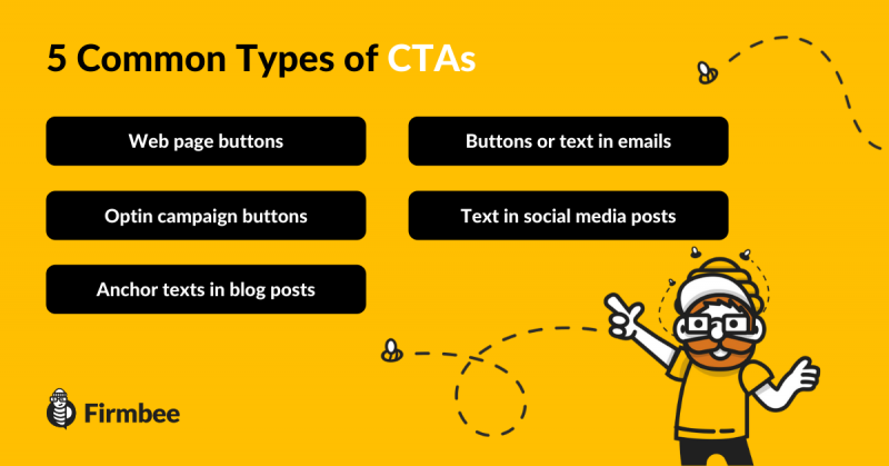
CTA means “call to action”. It is the key element of mailings, landing pages and websites. The essence of CTA is to persuade the recipient to perform a specific action – sign up for a newsletter, download an e-book or make a purchase. How to improve CTA? We present proven tactics.
Such a slogan is essential to encourage the customer to complete the designated action. So how to generate an effective CTA? Here are some proven tactics.
How to improve CTA – Table of contents:
- How to write a good CTA?
- An effective call to action motivates
- Create short CTAs
- Skillfully persuade
- Point out the social proof under the CTA
- Take care of the aesthetics of the CTA button
- A persuasive call to action is the key to achieving your goal
How to improve CTA?
You need to keep in mind that in order to effectively achieve the set goals of a specific campaign you should develop other call to action slogan suggestions than the typical “Click here”. Try to take a perspective of your potential customer and think of a suggestion that would get them to do a particular activity. Communicate the benefits that will result from clicking the link. This can also be a slogan that reflects the need, such as “Download an ebook and generate leads like a pro”.
An effective call to action motivates
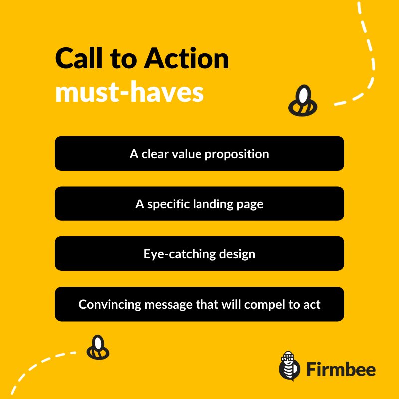
Your call to action is meant to simplify life and not indicate an effort on the part of the recipient. Thus, a better practice will be to use “Take advantage” rather than “Buy” slogans. People generally don’t like to part with their money. Therefore, instead of urging the customer to spend cash, show them the benefit they will get by investing time or money in performing the action indicated in the CTA. Develop slogans that are more than a reflection of the command mode – they should also motivate.
Create short CTAs
Remember that there is not much space for text on buttons. The most readable buttons are those with a limited number of words. In this case, the “less is more” rule applies as well. If your button is too long, it will probably lose its readability and there is a risk that it will not be noticed by the customer. This explains why you should make an effort to create a short but catchy slogan. Also, remember to match the language to your target audience.
Skillfully persuade
Avoid as much as possible using phrases such as “free report”. It is recommended to use the imperative mode, i.e., “pick up a free report”. Numerous CTA tests have shown that it is most effective to use the first-person form, i.e.: “I’m downloading a free report”. On the surface it may seem trivial, but it is worth testing on your own campaign how such a small change can modify the recipient’s action.
Point out the social proof under the CTA
Use the button environment with the CTA to your advantage as well. A good practice that will increase the effectiveness of the call to action is to add some social proof. Example? You can add under the button that 20 000 people have already done it (downloaded, bought, subscribed to the newsletter) before. You can also use existing recommendations from customers who have already taken this step. This will reassure your new audience that they are taking the right action.
Take care of the aesthetics of the CTA button
The shape and color of the button, the surroundings of that button with the slogan – you have to take care of the visual attractiveness of these elements. It all has an impact on the customer’s action.
Test different CTA options – the placement of the button, its color, etc. You may find that sometimes a small modification can increase your effectiveness. Also, avoid using generalities, instead of “sign up for the newsletter” try “get 10 tips to help you work more effectively”. Above all – test, change, analyze – with such practices you will reach perfection in writing catchy CTAs.
A persuasive call to action is the key to achieving your goal
If you are at the stage of designing a call to action – implement the tactics mentioned above. Use the language of benefits, focus on concreteness and value for the client. Also, test the buttons’ graphic design, compare them and draw conclusions. But remember to only change one element at a time – color, text, or social proof – or you won’t be able to determine which modification turned out to be crucial.
If you are interested in more SEO topics, check out this article where we discuss 7 things worth to keep in mind.
Author: Zofia Lipska
With over 10 years of experience in digital marketing, Sophia not only knows the rules of this industry but above all knows how to break them in order to achieve outstanding and creative results.
