One or two photos on a white background, a table with specifications, often copied from the manufacturer, price and delivery terms… In theory, preparing a product page in an e-store should not be a challenge, but in practice – the above recipe is almost a 100% guarantee of failure. In the increasingly competitive world of e-commerce, you need much, much more to convince the customer to buy. So how to create a product page where no element is left out?
Product page – table of contents:
Primary purpose of the product page
The primary goal of product pages should be to provide users with all the information they need to make a purchase decision and to guide them through the buying process as smoothly as possible. How to do it?
Inform, but in a persuasive way
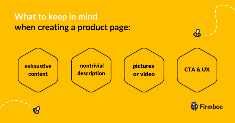
The product should obviously be the focus, but you need to present it in a certain way. The site should include answers to all the questions that users might ask, even if they don’t ask them directly.
And since a picture says more than a thousand words, there can be no lack of photos. They should present the product as accurately as possible, from all sides, and in their finest form in use, i.e. clothes on a model and a piece of furniture in a specific arrangement. E-commerce giants reach for videos more and more often, which is also worth considering if we have such budget possibilities.
Product description
The product description should also be as original as possible. Copying it entirely from the manufacturer’s website or from the competitor’s website drastically reduces the chances of achieving a high position in the search engine. Google values original content, but this is not the only reason why copying dry, manufacturer’s specifications is not a good idea. Users in the vast majority expect to be persuaded to make a purchase by a story about the features and benefits of the product, not only by raw data and parameters.
Also, include the different variations of products you offer, and let customers know which ones are available so as not to waste their time. If they are looking for black sneakers in size 40, they won’t opt for white sneakers in size 36, but they can leave an email address – if they are willing to wait until their dream product is available.
CTA and UX
The product page has one goal: to make the customer click “Buy”. However, if the user has trouble finding the right CTA (call to action), nothing will come out of it, because he or she will not look further for long.
UX is crucial in this case. The user should know at all times where they are and what to do to get where they want to be. The area around the CTA button should be tidy and visible immediately. If it’s at the bottom of the browser, it’s a mistake that can cost you a lot.
This, however, generates some problems. Since all information should be clearly displayed and visible at the top of the browser, and the design – according to the latest trends – should be clear and minimalistic, it may be difficult to fit everything that should be on the page. Then, however, it is good to use features such as drop-down tabs, separate bookmarks, and content that displays when the cursor hovers over it. This way, users who are curious about details will be able to find them easily, and the rest will not feel overwhelmed.
For the same reason, the overall structure of the site and the information architecture used are of utmost importance. When it comes to UX, it is not advisable to be innovative, it is much better to bet on the “known and liked” solutions so that the users feel “at home”.
Do you want to gain more useful tips about managing your business? Join our Facebook community to stay in touch!
Author: Martin Sparks
E-commerce enthusiasts which constantly digs around the internet in order to make sure he hasn’t missed any important information on the topic of starting and scaling profitable online stores.

