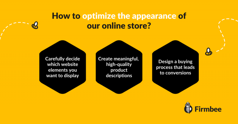
The number of online stores in our country is growing at a noticeable rate, so it’s good to take some time and think how to optimize the appearance of your online store. The software purchase which is becoming easier and easier to use makes many stationery stores start to migrate to the Internet. In the era of considerable competition, just entering the world of e-commerce is not enough to generate fully satisfactory sales. Our online store is our business card and at the same time a place where the customer should feel at ease, focusing only on the products that interest him. So how to optimize the appearance of our online store to be a natural incentive to make a purchase?
How to optimize the appearance of your online store? Best practices:
- What color can help you optimize the appearance of your online store?
- What to leave and what to remove in order to optimize the appearance of your online store?
- Why is product description important?
- How do you design the entire buying process?
- Summary

More and more often it forces the owners of online stores to take care of the smallest details, elements to which so far they did not pay much attention. A few of them are so important that it’s worth taking a closer look at them.
What color can help you optimize the appearance of your online store?
Color psychology
Color psychology is a subject that is being dealt with by an increasing number of professional marketers. Today sales are not only about the product and its price, but also the feelings that we can arouse in the customer during the purchasing process.
Depending on the type of product, industry, its elitism, we should choose an appropriate color, which will strengthen our message, while giving the potential customer a sense of freedom and comfort during the purchase.
What does it look like in practice?
The color black is reserved for luxury goods. The human brain perceives it as an elitist color, indicating good taste and a sense of high quality. It is ideal for stores selling expensive jewelry. What feelings does red evoke in us? Of course, passion, desire, in extreme cases aggressiveness and self-confidence.
So would you use this color in a toy store? In most cases, we are not able to determine a specific reaction to a given color by all potential customers, so our main task is to avoid negative colors, completely unsuitable for our industry.
What to leave and what to remove in order to optimize the appearance of your online store?
What to avoid?
Having too many elements in an online store doesn’t help. Too often I came across a site where the number of boxes, banners and categories made it very difficult to choose the product I was interested in.
Leaving an online store takes only a few seconds, which means that we have to use this time to the maximum to attract the attention of a potential customer. Therefore, it is worth looking carefully at your website to eliminate all the elements that have the potential to divert attention and… take up unnecessary space.
How often do your clients contact you using Skype widgets? In many stores, these elements still occupy a place of honor at the very top of the site and can be your enemies if you want to optimize the appearance of your online store.
Another unnecessary place is occupied by boxes containing the latest promotions and products, so passionately added by most online store owners. Their real disadvantage is that the view of the product changes every few seconds, so the chance that a potential customer will be interested in it is close to zero.
What should be placed in a visible place of the online store?
Our client, apart from the product and its price, is interested in two important issues:
- The first of them is the time and cost of delivery. These elements should be placed in a very visible place, especially if the promotions are connected with this service. If the delivery is free, it is very often the key to convince the client to purchase in our store.
- The second important issue is contact. If I have any doubts about a product, I would like to get answers to my questions at the same time. Having to look for a phone number or e-mail address will effectively convince me to… look for another store.
Why is product description important?
Distinguish your store among others
Online store owners repeat one very important mistake. They usually copy the product description from the wholesaler’s or manufacturer’s website, but miss a significant element. This element can actually be key if you want to optimize the appearance of your online store.
Other e-commerce companies do the same. By copying the description we do not distinguish ourselves. We give the client the same thing which he has already seen in several other stores.
If our price is a few Euros higher, we do not provide any argument for purchasing from us. The most important feature of a good product description is a concise explanation of why it is worth your interest. The fact that a child’s toy is red and plastic is useful but also… visible at first glance.
People buy stories, not features
However, if we inform that a few moments with this toy can give a child many hours of smiles and joy, we will effectively win the attention of parents and thus our future customers.
Emotions sell better than dry information, so try to make a little effort to enhance this element. The effects will be noticeable.
How do you design the entire buying process?
Once we manage to convince a potential customer to add the chosen product to the basket, all that remains is to successfully guide him through the purchasing process.
Unfortunately, according to various studies, from 40 to 70 percent of customers abandon the purchase after selecting the right product. Unfortunately, there are several reasons for this and eliminating at least some of them will help us finalize more sales.
There are still too many stores that extend the way from adding the product to the basket to the moment of payment and thanking for the purchase. The element which should be remembered is to inform the customer about how many steps are ahead of him, not to test his patience in any way.
It is also not worth insisting on the obligatory registration, especially if your industry does not require making cyclic purchases of the same type of products. Most customers will be discouraged by the need to create a new account in the next place. Think about it, if you really want to optimize the appearance of your online store.
Summary
When designing an online store, it is not enough to add products, copy descriptions from the manufacturer’s website and run ads on Google.
Today, to be successful, it requires much more effort than just a few years ago. Refining all the elements requires tests and some time, but every positive change should bring noticeable effects in the form of an increasing number of sales.
Author: Martin Sparks
E-commerce enthusiasts which constantly digs around the internet in order to make sure he hasn’t missed any important information on the topic of starting and scaling profitable online stores.


