Not so long ago, the effectiveness of online advertising campaigns was verified on the basis of how many people clicked on the ad and visited the website. But companies quickly caught up and realized that ads should bring about specific sales effects. Thus, currently, we check how many internet users, after entering the landing page, made some kind of activity – for example, subscribe to a newsletter, set up an account, download a given program or use a contact form.
5 most common landing page mistakes – table of content:
- Information overload
- Uninteresting headlines
- Too much content
- No call to action
- Poorly chosen and uninteresting graphics
Preparing a campaign is not only about choosing the right keywords, developing an attractive advertising text, and creating a banner. Equally important is the landing page, which will be displayed after clicking on the advertisement. The first page, which is displayed to Internet users after clicking an advertising link is called a landing page.
The task of landing page is conversion, i.e., making users perform a specific action. Such an action may be commencing shopping, registering on the website, informing friends about an offer or leaving your contact details (e-mail, phone number, other).
How to encourage your customers to do it? First of all, by avoiding the 5 most common landing page mistakes that cause a decrease in conversions.
5 most common landing page mistakes:
1. Information overload
The most effective landing pages are those where the user is asked to perform one simple, specific action: for example, to register on the site. Studies have shown that customers who had several different options to choose from felt confused, couldn’t make a decision right away, and… most often just abandoned the purchase.
Here is a sample landing page of www.cruise.com:
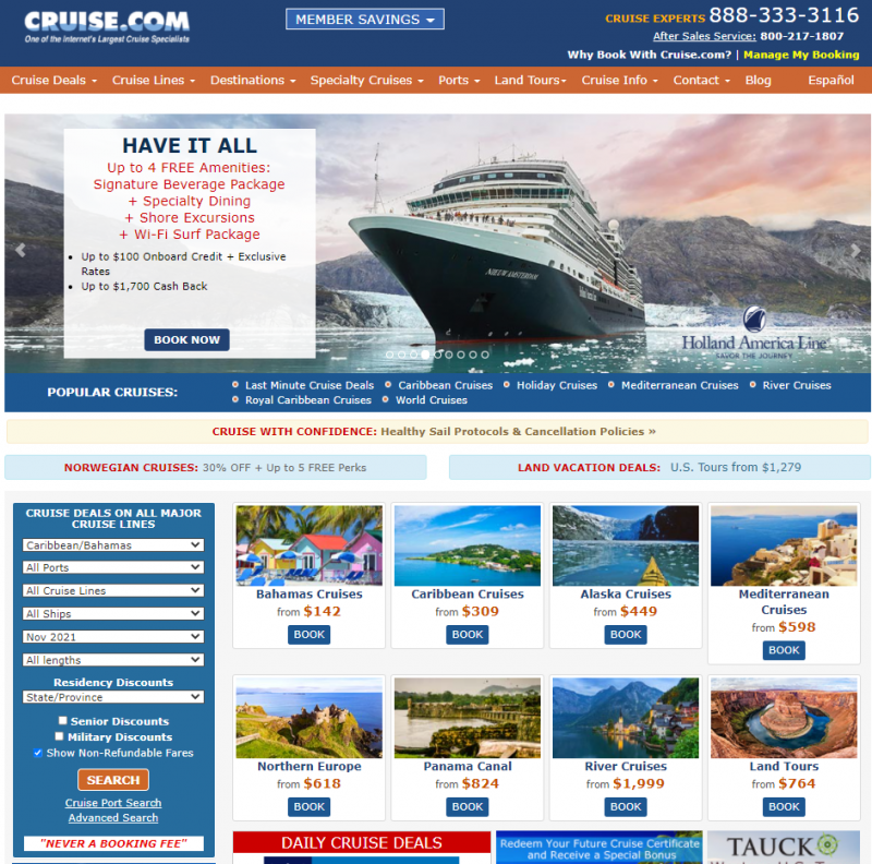
The amount of photos, titles, texts, and information chunks is very big. It can make the user feel overwhelmed and lead him to abandon the website.
2. Uninteresting headlines
3 seconds – apparently that’s how long we need to judge whether some information is interesting for us. The headline is therefore one of the most important elements of the page. It must be eye-catching and encouraging with the offer, showing the benefits for the customer.
www.wistia.com has solved this very well:
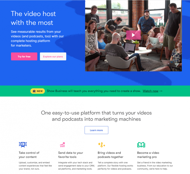
The headline on the landing page is short, effective and attracts attention. It simply answers the question “What’s in it for me?” which is the most important question from the customer’s point of view.
3. Too much content
A landing page can’t contain too much content. For no more than 12 seconds, but just for 8 seconds a person is able to focus their attention on a single message, according to research from the National Centre for Biotechnology Information.
For this reason, the advertiser has only 8 seconds to encourage the customer to act. The less text, the better. The key is a short and concrete message that expresses more than a thousand words. You need to write in the language of benefits – but concisely and specifically.
One parcel delivery company in the United States doesn’t write about all their benefits on the landing page. Instead, they say: With our envelopes, you’ll make a great impression before they even tear it open.
letterjacketenevelope.com landing page:
4. No call to action
Check out, Sign up, Create account, Submit form… Creating a good call to action is already half the battle. Its task is to make the user take action: register on the website, click a link or download a program, i.e., everything that can bring money to the company. There is no universal recipe for the most effective call to action.
Most companies use standard formulas like Sign up for an account, which on one hand are correct because users react subconsciously to such commands, but on the other hand do not evoke emotions and do not emphasize benefits.
A small change to Create an account and check us out with no obligation or Create an account and enjoy the cheapest international calls! can make the number of conversions increase significantly. But a slogan alone is not enough.
www.delta.com landing page example:
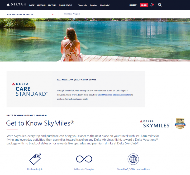
Even though the design of this website is quite minimalistic, there is no visible Sign-up button on the page. The only place you can find it is the upper menu.
The button on the landing page should stand out and catch the eye – here, however, other information catches more attention.
5. Poorly chosen and uninteresting graphics
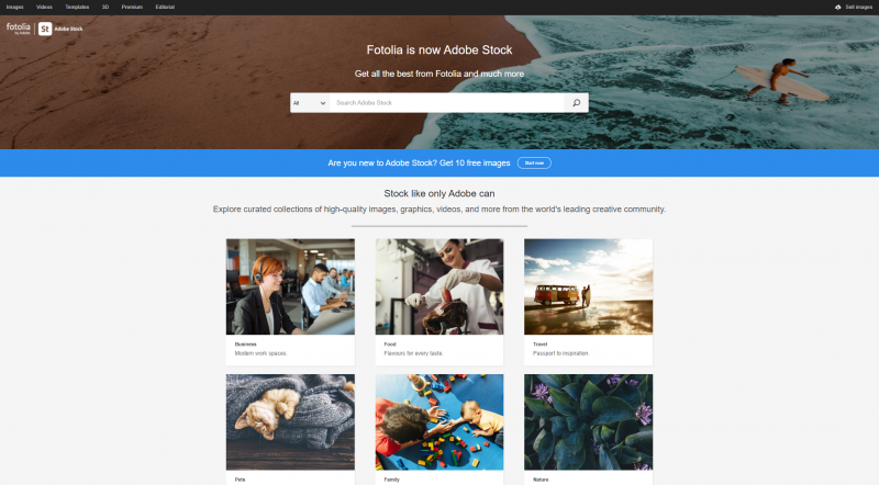
A landing page is a business card of a company. The first impression counts, that is why the page must look professionally created. Mismatched colors, text blending with the background, or poorly chosen font can spoil the whole effect. Internet users buy by sight, so it is worth tempting them with fine, attractive photos. For this purpose, the company can take pictures of products on its own or use online services with stocks.
Fotolia.com – a great place to find photos for your website:
The best solution is to go for simplicity and minimalism. Call to action will be even more effective if it is distinguished by an eye-catching color.
Of course, there is no single effective recipe for an effective landing page. Not every solution will work for absolutely every campaign. However, avoiding basic mistakes, while still experimenting and comparing which landing page, will generate higher conversions.
Do you use landing pages in your campaigns? What other mistakes do you think should be avoided when creating a landing page?
Author: Zofia Lipska
With over 10 years of experience in digital marketing, Sophia not only knows the rules of this industry but above all knows how to break them in order to achieve outstanding and creative results.

